
I wrote about this map in my book and I often use it as a teaching tool in my classrooms. It is hanging in my office and today I was meditating on it as I did yoga, thinking about the inevitability of change. I am always fascinated by the sheer size of the Roman Empire (the height represents the geographic territory it covered and the width represents the years of its existence). When I look at this I always imagine what it must have been like to be alive in the year that it collapsed. And then I look at the USA, a little purple rectangle in the lower right hand corner of the map. How small our history and influence is in comparison. And I wonder if we too will just end one day like so many other empires in human history. Having spent most of my adult life studying the collapse of communism in Eastern Europe in the late 20th century, this seems more like a real possibility to me than to most other Americans who too often take our nation and its institutions for granted.

The full World History Timeline from Oxford Cartographers hanging on my office wall
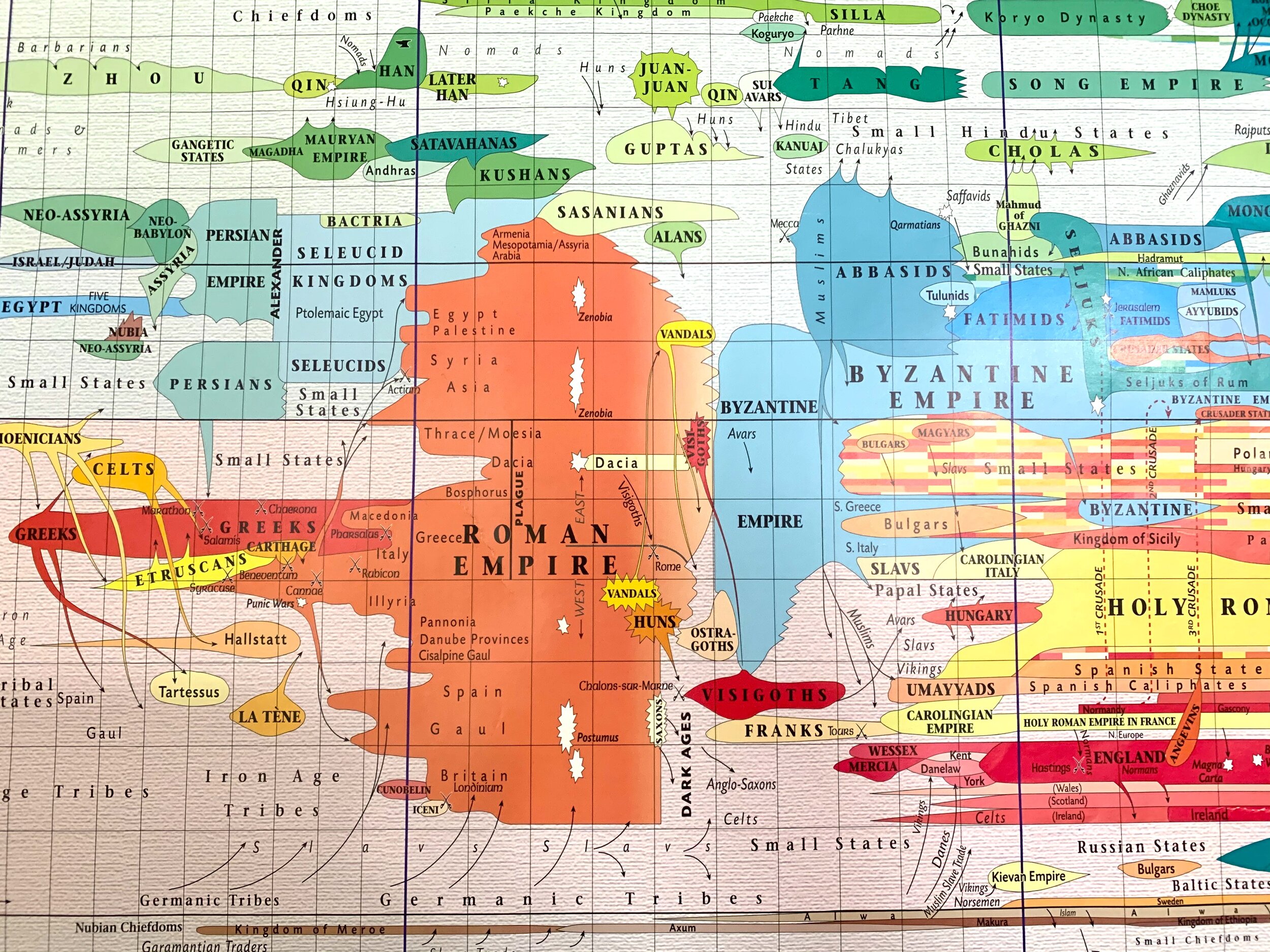
A detail of the Roman Empire, the large orange shape that dominates the whole map. It existed for centuries and then it just fell.

Here in the lower right had corner is a little purple rectangle for the USA. On this map it seems so insignificant.